E-commerce like no other – Interface design for HoReCa companies. Interview with Kamil Tatol
In the solutions that we have designed, we have been able to increase conversion rates (+84% on mobile for KFC) or the value of the shopping cart (also by several dozen percent) multiple times. At the right scale, we are talking about huge profits resulting from a well-designed product.
The interview with Kamil Tatol, CEO and designer at Flying Bisons, a company specializing in designing digital solutions that have created and optimized solutions for brands such as KFC, Burger King, Domino’s Pizza, Pizza Hut, and kikfit.
Ordering Stack: What is the reason for a business such as a restaurant to be interested in designing its interfaces and applications?
Businesses have already moved to the digital world many years ago – this process has already begun and continues unabated, and nothing can stop it. The gastronomy industry, including restaurants, is no exception.
OST: But wouldn’t solutions designed for e-commerce be sufficient?
KT: In recent years, there has been a popularization of digital solutions, including e-commerce, but also marketplaces and mobile applications such as Pyszne.pl, Uber Eats, or Bolt Foods.
It seems that a website, even with the ability to order food online (which is, in fact, e-commerce), is essential, but customers expect more and more. Customer expectations are driving the change.
In the era of the digital revolution, experience can be compared to the new currency one may spend, invest, and brands are fighting for. Experiences with brands are the most important and defining. And expectations regarding them are high and will never be lower. Rather we will see them skyrocket.
OST: So how to respond to these skyrocketing expectations?
KT: Consumers expect the solutions they use to be intuitive, simple, and functional. It is also worth noting that customers have never had so many options to choose from. Nowadays, if I want to order food, I can simultaneously go to my favorite restaurant’s website, Pyszne.pl, and open 10 tabs with selected eateries, and in the meantime, browse the various cuisines of the world in the Uber Eats mobile app.
In Flying Bisons I design digital products every day, and from my personal experiences, I know that the competition is enormous – both in terms of the pursuit of customers and the digital products and services offered. Global solutions such as Uber Eats or Bolt Foods are created by internal teams of dozens, if not hundreds of experts who, from month to month, add new features to their applications to optimize conversion and customer experience. They are maxing out all they have by fractions of a percent. With millions of users, it will bring enough ROI to be justified.
OST: Daunting.
KT: This is precisely what makes many restaurants not even try to compete (due to a lack of resources and competencies) and, in fact, “surrender” by joining marketplace platforms, where a commission is required for all orders.
An alternative is to use available solutions, such as white-label platforms (e.g. Ordering Stack), which allow businesses to use well-designed and optimized products under their own brand in exchange for a monthly subscription fee. This is certainly an interesting alternative to the incredibly difficult and expensive path of building products in-house or relying solely on marketplaces like Pyszne.pl. Also, in this way value/cost ratio is exceptionally high.
OST: Getting back to the ROI – can we even quantify the results of something as elusive as “experience”?
KT: From experience, I know that the quality of interfaces and user experience has a direct impact on business results. In solutions that we, as Flying Bisons, have designed, we have been able to increase conversion rates (+84% on mobile for KFC) or the value of the shopping cart (also by several dozen percent) multiple times. At the right scale, we are talking about huge profits resulting from a well-designed product.
Additionally, digital solutions allow for the automation of a range of processes and activities, which translates into lower operating costs, so in fact, businesses can be optimized on two fronts – by increasing revenue and cutting costs, which should result in higher margins.
However, it is worth noting that every investment should aim toward a return on that investment, and scalability is crucial in all of this. It is the scale that most defines which solution is optimal for a given entity. Other important factors include the nature of the business and the business model, as well as the type of offer, including the level of margin on the sold dishes and products.
It is difficult to find a universal answer as to when it is worth investing in UX and whether it is better to hire a specialized firm or start building your own team. The answer to both questions is “it depends”. From experience, however, I know that if the topic of UX arises in a company, it is usually the right time. If UX is not a problem, owners often do not realize it or simply do not have time for it – although it can sometimes be the biggest lever for growth.
OST: We started our conversation with interfaces for HoReCa (Hotel, Restaurant, Catering/Café). What sets them apart from regular e-commerce and what to pay attention to?
KT: E-commerce, by definition, concerns the sale of various things online, that is, through the Internet. In my opinion, digital solutions for the HoReCa industry are a unique subcategory of e-commerce, often referred to (at least, that’s how we at Flying Bisons see it) as food commerce, which means the online sale of food in an analogous way.
Products offered by restaurants have their own specific features such as ingredients, categories (e.g. appetizers, main courses), availability at certain times of the day, etc. Therefore, HoReCa interfaces must take these differences into account and allow for easy browsing and selection of products from the menu. For example, some customers may be interested in information such as macronutrients or the number of chicken pieces in a set (which of course does not occur in most of e-commerce categories).
OST: And next-day delivery brings no WOW effect.
KT: Exactly! In the food commerce industry, the product is, as you might guess, food – ideally appetizing, hot, and wonderfully fragrant. Customers are often hungry and need their orders as soon as possible. A good idea is to have an attractive presentation of products (such as high-quality photos), enticing product descriptions, and, above all, clear delivery time displays.
Nowadays, customers want to know “how long do I have to wait for delivery and why is it taking so long?” If we have a good logistics partner (such as Stava) and offer fast delivery, we can use it as a competitive advantage.
OST: As strong as price?
KT: Restaurants often offer promotions, discounts, and special offers for regular customers. HoReCa interfaces must allow for the personalization of the offer and adaptation to individual customer needs. Product personalization often occurs, where you can order a dish with a chosen sauce or a spicy version, for example.
OST: A lot of clicking and tweaking the product before purchasing it.
KT: That’s why HoReCa interfaces must be integrated with kitchen and logistics systems to enable easy processing of orders, fast meal preparation, and delivery to customers. Time and real-time integration are crucial, as everyone expects the dish to be hot upon delivery. The basis of UX is reliability and accessibility, so even the best system won’t help us if it simply… stops working.
OST: That sounds complicated.
KT: And it is, but should never be for the customer! Interfaces for HoReCa must be easy to use, intuitive, and fast. Customers who want to quickly place an order don’t have time to search through complicated interfaces. This is important in standard e-commerce, but it is even more important in food commerce.
It is also about the context. In interfaces for the HoReCa industry, the context of the user’s path and product prices are crucial. For example, the product page is not as important as in traditional e-commerce because products offered by restaurants are often cheaper and ordered in larger quantities. Therefore, customers often add products directly to the cart from the category or product list level, and the product page is only used when the customer wants to see product details or make changes to the order. Therefore, interfaces for HoReCa must take into account this contextuality and allow for easy browsing of categories (e.g. long page with scrolling or tabs) and quick adding of products to the cart from the list or category level (i.e. quick add button).
OST: Having all these in place, it is no surprise that interfaces are so look-alike all around the world.
KT: In the case of food commerce, there is a high probability that we are dealing with a returning customer. After all, we often order our favorite dishes from the same restaurants. A complete opposite situation of a one-off purchase like a bike or garden equipment. It is worth taking care to ensure that our e-commerce offers an easy and fast path for regular customers – this of course refers to user accounts, past orders, and the ability to repeat them, and above all to saving delivery data and payment methods. Due to existing solutions (Allegro, Uber), the standard is becoming what is called one-click payment.
One of the pitfalls of design is attempting to create a universal interface for both groups, which can lead to designing an interface that is uncomfortable for both groups. In reality, design for the customer and design for the employee should be designed separately, taking into account the specifics of each group. It is also important to consider the context in which the interface is used by both groups. The customer interface and the employee interface will be used differently, in different situations and contexts, so the design must take these differences into account to provide optimal usability for each group.
OST: What aspects of running a restaurant can be transferred through UX to an app/device?
KT: There are many aspects of running a restaurant that can be transferred to UX design for an app or device. For example:
- Personalization, where the app can use customer preference data (such as favorite dishes) to personalize the menu and recommend appropriate dishes.
- Quick ordering, where the UX can be designed in a way that allows customers to quickly and easily place orders without having to browse the entire menu.
- Order tracking, where the app can allow customers to track the status of their orders and inform them of the estimated delivery time.
- Online payments, where the UX can be designed to make payments easy and secure without leaving home.
- Loyalty programs, where the app can offer loyalty programs and reward customers for making purchases.
OST: This sounds compelling for QSR and that’s cool. But I wonder if some high-end restaurants can also benefit from online ordering or UX design.
KT: High-end restaurants can also use UX design to increase the value of their brand and reinforce the impression of exclusivity. The design of an application or device can attract customers and offer them unique experiences that are associated with dining at this level of the restaurant.
For example, the application may include exclusive photos of dishes, and the UX can be designed in a way that reflects the aesthetics and style of the restaurant. In addition, interactions with the application or device can be designed to reflect the professionalism and quality of service that is characteristic of high-end restaurants.
All of these elements can contribute to a better customer experience and increase customer loyalty, which in turn leads to increased revenue and business development.
Although UX design of an application or device can contribute to a better customer experience, it is important to remember that there are certain aspects of the experience that cannot be transferred to the digital world.
One of these elements is interpersonal relationships, which are particularly important in high-end restaurants. In such places, waiter service can be just as important as the quality of the food, as it can have a tremendous impact on the experience.
Waiters in high-end restaurants not only offer advice and assistance in choosing dishes, but also provide unique experiences such as table setting or presenting dishes. Their professionalism, courtesy and attention to detail are crucial for building a sense of luxury and elegance.
To sum up, although UX design of an application or device can support the customer experience, interpersonal relationships and interactions with the staff are irreplaceable in high-end restaurants. Their role in creating atmosphere and impressions cannot be overestimated and cannot be completely replaced by the digital world.
OST: We have at least three environments at our disposal – desktop, mobile, and kiosk – how do they differ from the perspective of UX?
KT: In today’s world, users use different devices to browse content and make purchases. Therefore, UX design must take into account the different environments and technological conditions in which the user may find themselves when interacting with the application.
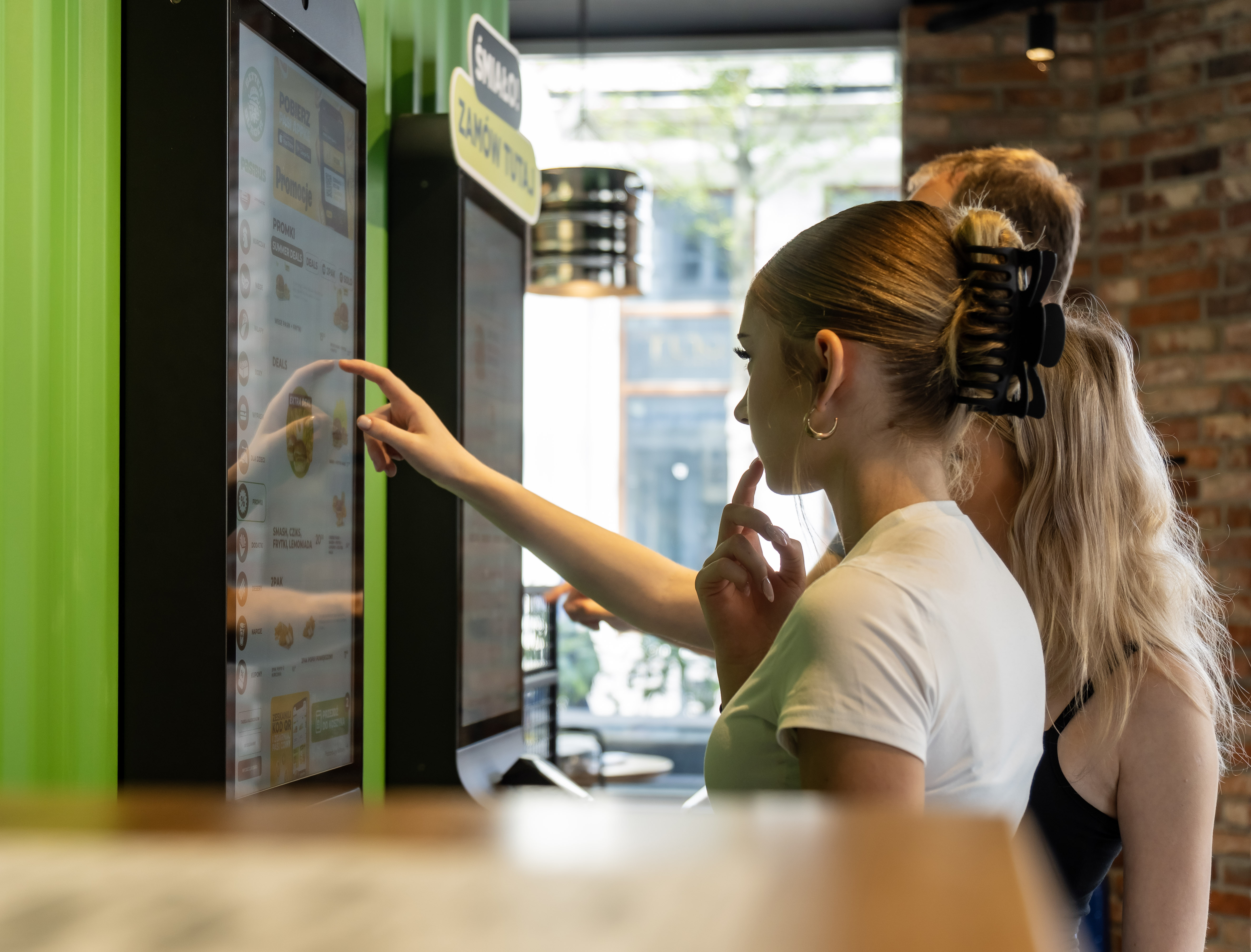
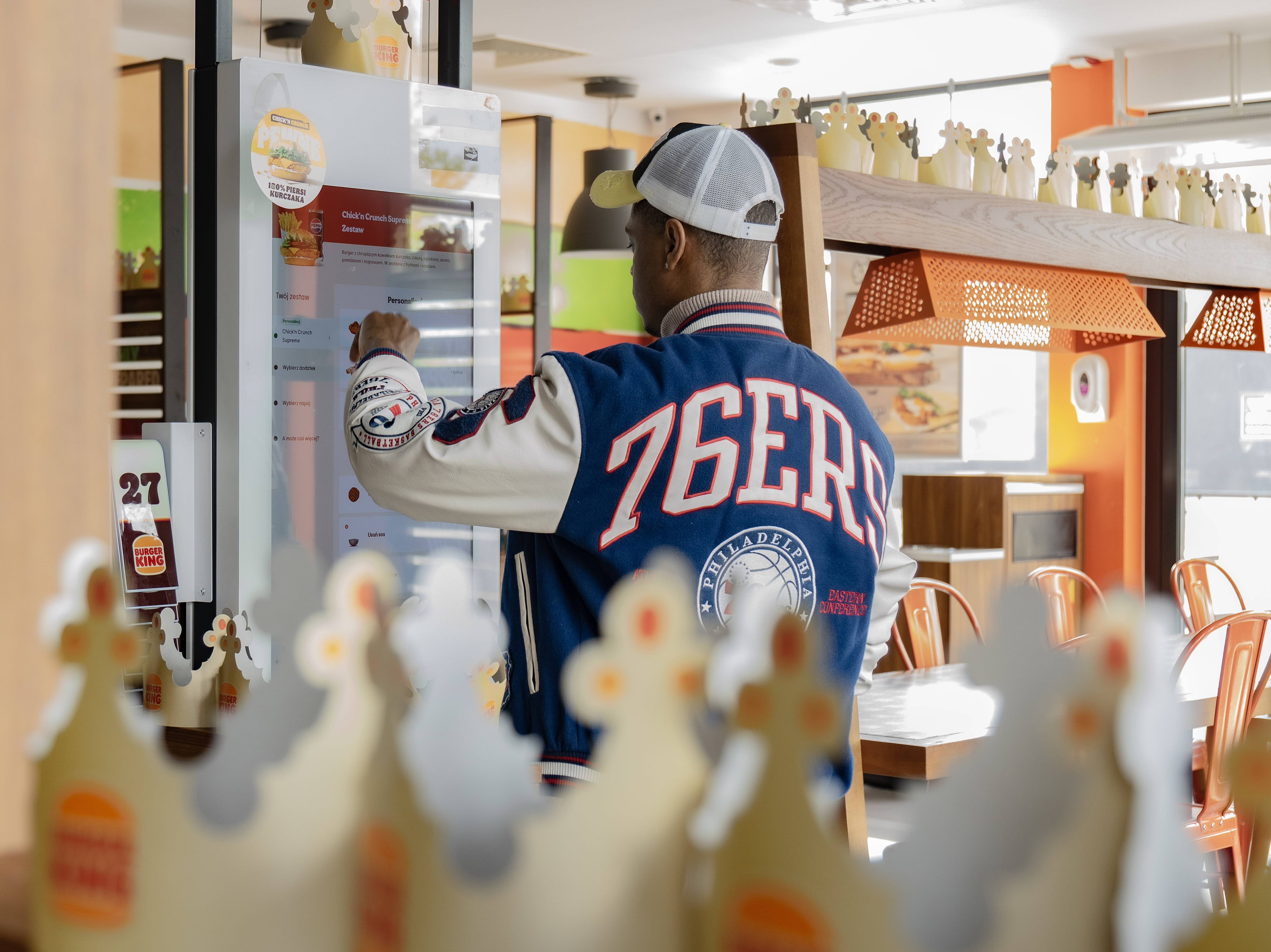
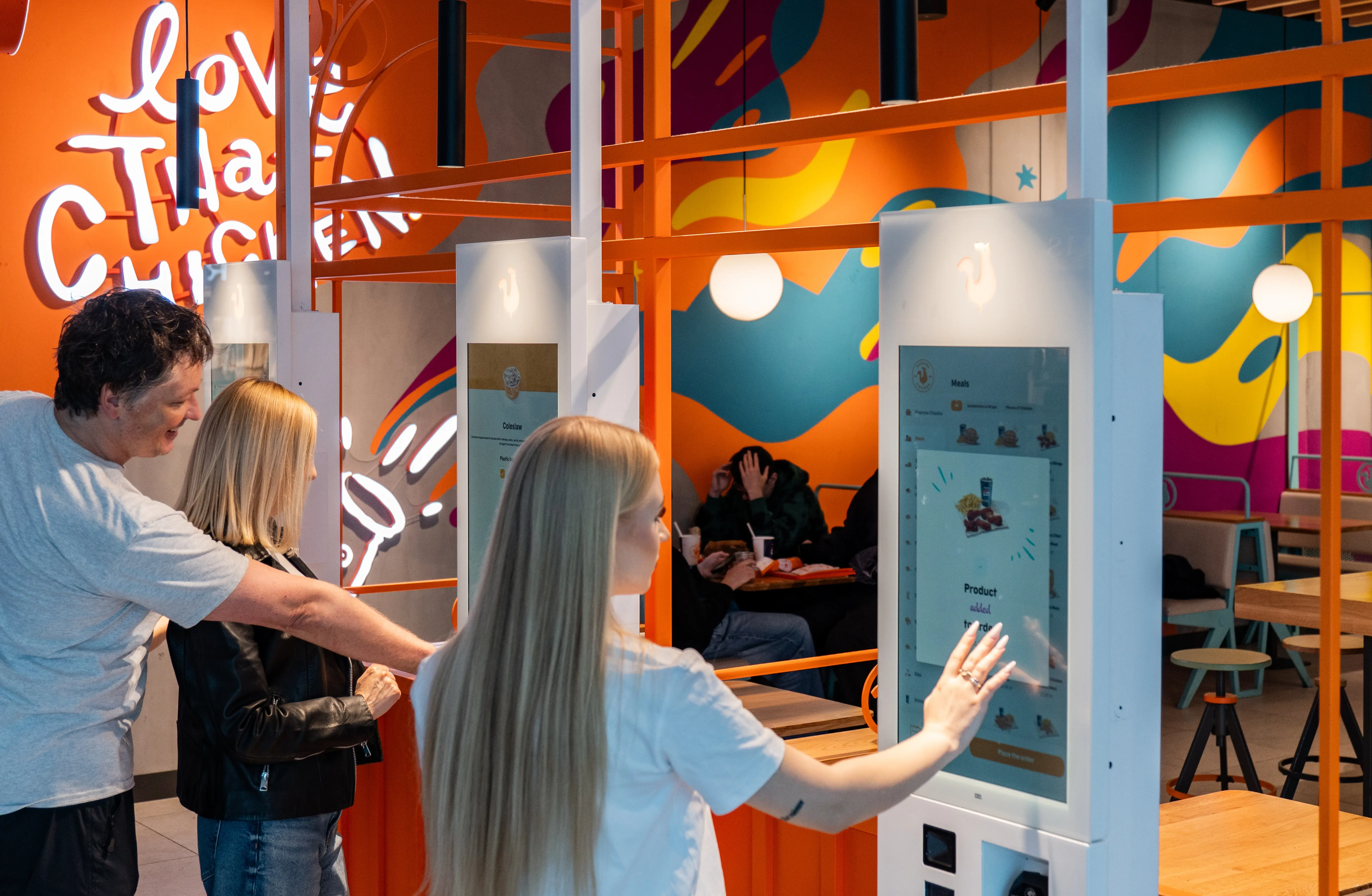
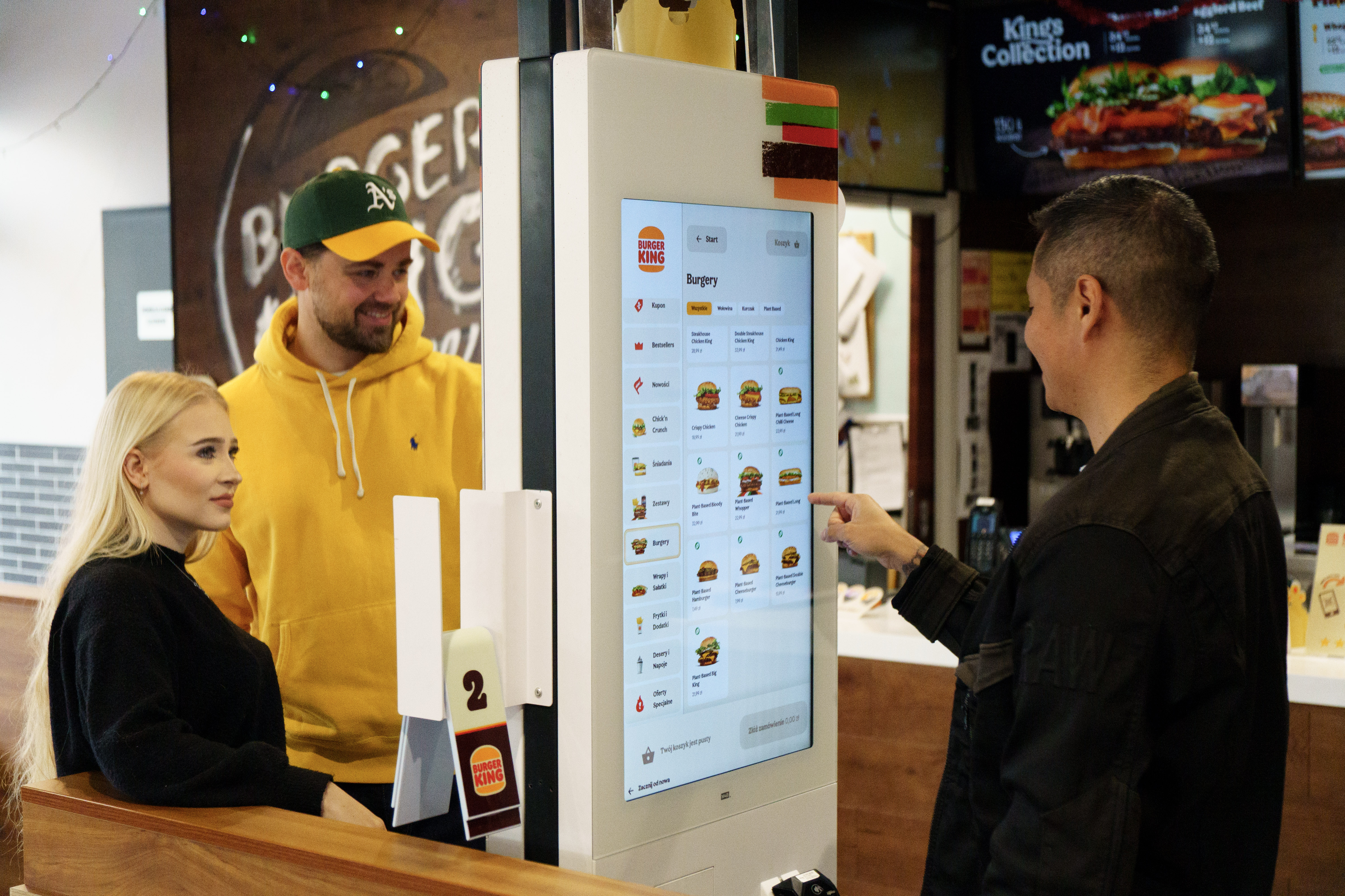
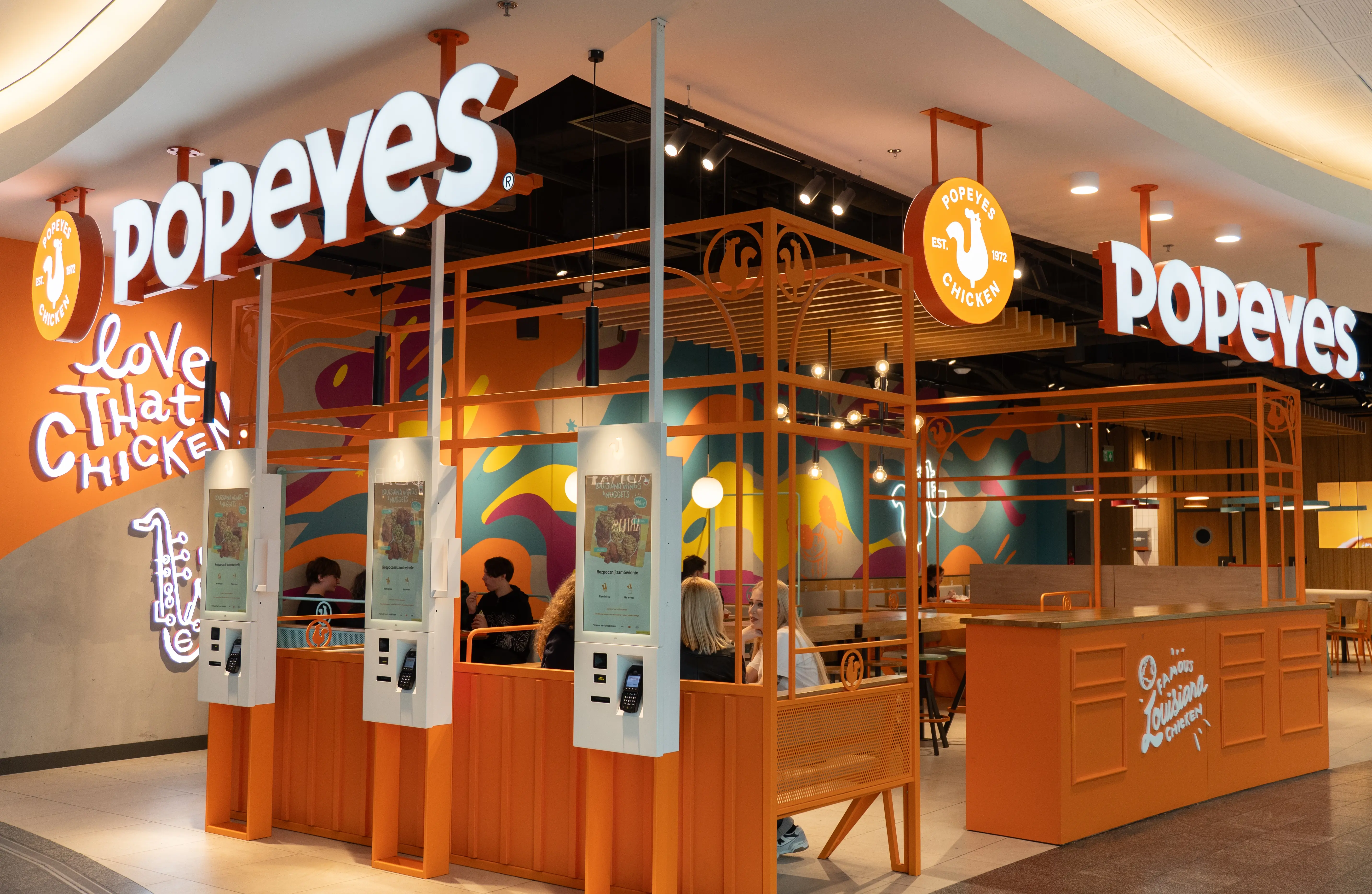
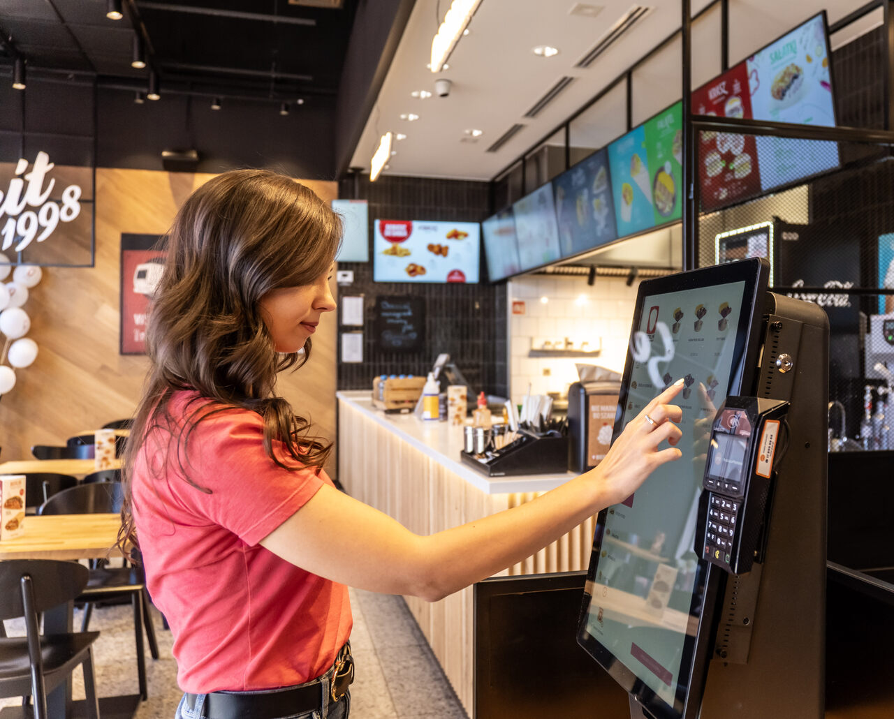
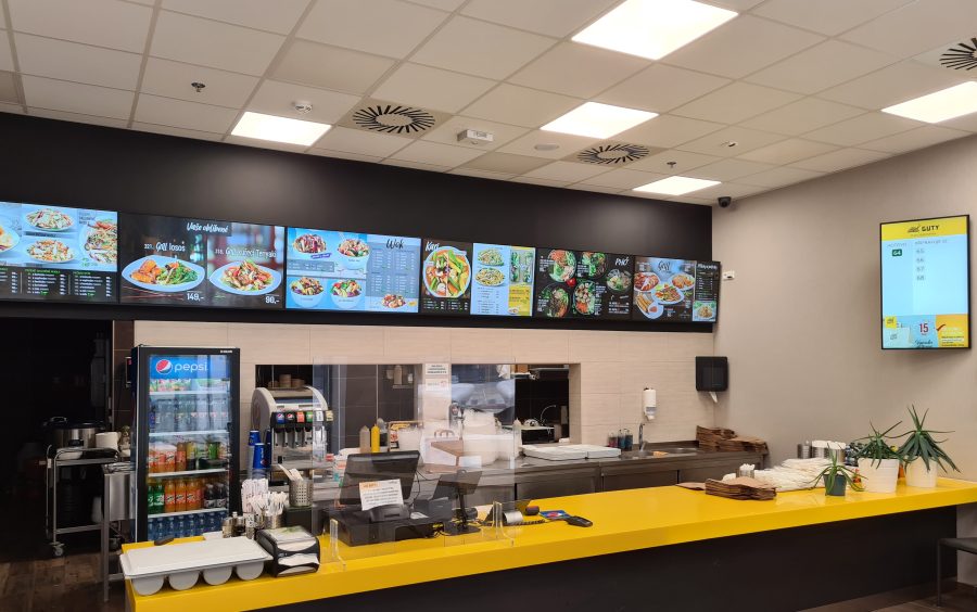
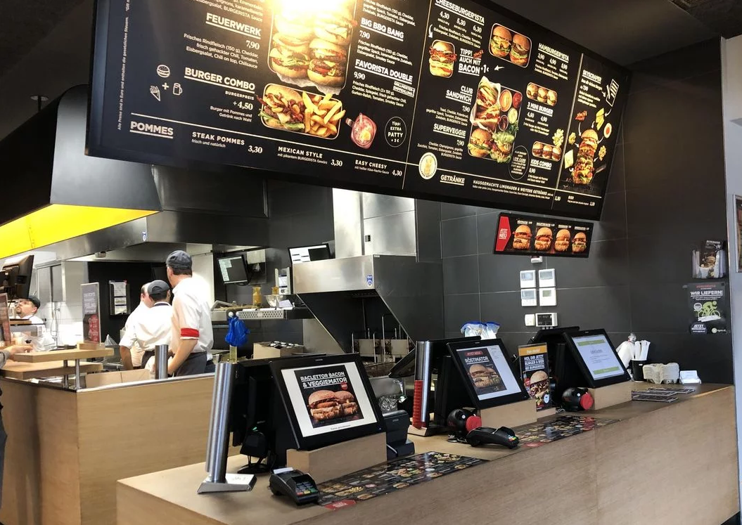
The desktop environment is characterized by a larger screen, which allows for comfortable content browsing and more complex interactions. The mobile environment has a smaller screen, which forces designers to create more condensed content and simpler, more intuitive user interfaces. The kiosk environment, on the other hand, usually offers a touch screen, which affects the way users interact with the application. A combination of mobile and desktop, big in size, used with a touchscreen.
In summary, designing UX based on the Omnichannel paradigm requires designers to consider that users may switch between different devices during a single session of using the application. Therefore, it is important to ensure consistency in the user interface and enable smooth transitions between different devices. For example, a user should be able to start the purchasing process on a desktop, continue it on a smartphone, and finish it on a kiosk, and the whole process should be consistent and intuitive on each of these devices.
Reconciling different devices and their constraints with the Omnichannel paradigm requires designers to take into account the differences in interfaces for each environment and ensure consistency in the user interface across them. It is also important to design UX responsively so that the interface can adapt to different screen sizes and different ways of interacting with the user. This way, users will be able to use the application in a consistent and intuitive manner, regardless of which device they choose to interact with the application.
It is also crucial to leverage the strengths of each touchpoint (such as more screen real estate on desktop or touchscreens on mobile and kiosks), while mitigating the weaknesses (such as limited space on mobile which should result in simplified interfaces).
OST: How can we reconcile different devices and their conditions with the Omnichannel paradigm?
KT: Great question! Omnichannel is a familiar concept, but there are always new buzzwords and trends emerging in the world of UX and beyond.
In the context of omnichannel, it’s worth paying attention to terms like “phygital,” which refers to the combination of physical retail experiences with online channels, and “voice commerce,” which involves using voice assistants to make purchases.
In terms of UX, some current trends include the “dark mode” feature, which reduces eye strain and increases user comfort, as well as the growing importance of personalization and process automation. With the development of artificial intelligence and machine learning, we can expect to see increasingly intuitive and personalized user interfaces.
In the HoReCa industry, key developments will revolve around mobile payment technologies, automation of ordering and customer service processes, and the growing importance of sustainability and environmental responsibility. After COVID-19, there will be increased emphasis on providing services in a safe and hygienic manner, which will necessitate the introduction of new solutions related to touchless customer service and increased attention to cleanliness and hygiene in gastronomic locations.
OST: VR and AR solutions are also a buzzword, but are they relevant?
KT: Indeed, VR (Virtual Reality) and AR (Augmented Reality) solutions are becoming increasingly popular. These are technologies that can have a significant impact on the HoReCa industry. Thanks to VR and AR, restaurants and hotels can create unforgettable experiences for their customers, for example by allowing them to virtually tour the hotel, enjoy food in hard-to-reach places, or prepare food in virtual reality.
VR and AR can also help train employees, for example by simulating situations they may encounter at work. Additionally, VR and AR can assist in designing interiors and arranging spaces in restaurants and hotels, allowing customers to familiarize themselves with the design before it is actually implemented. One example of using AR in the HoReCa industry is an application that allows customers to order a meal using the view from their smartphone camera and adding an interactive layer with the restaurant menu.
OST: We are talking about revolutionary concepts and disruptions in the industry. But can you see some interesting, game-changing applications of them today?
KT: There are already very interesting places on the Polish culinary map, such as Le Petit Chef. This restaurant offers not only exquisite dishes but also an interactive culinary animation show that takes place directly at the guests’ table. This is possible thanks to the use of special projection technology, which brings to life the story of the titular little chef’s culinary adventures.
During one evening at Le Petit Chef, guests can experience unforgettable culinary impressions, being transported to different parts of the world along with the animated character, with each dish from the served menu being an element of the story being told. This unique approach to preparing meals attracts not only foodies but also lovers of new experiences and technology who want to try something completely different and unique.
OST: What benefits can a restaurant gain through UX design?
KT: A restaurant can gain many benefits through UX design. Above all, improving the user experience can attract new customers and increase the loyalty of existing ones. UX design can help create more intuitive menus and an easier ordering process, which can reduce the number of order errors and shorten the wait time for meals. UX design can also directly translate into better business (as mentioned earlier) by increasing the value of the shopping cart or order, increasing conversion rates, and also the frequency of purchases (or returning to the restaurant).
Additionally, through UX design, a restaurant can also increase operational efficiency, reduce costs, and increase revenue. Optimization of processes and easier access to information (such as menu or promotions) can help increase sales, and simplification of customer service processes can speed up the service process and shorten queues.
OST: The key element of UX testing is A/B testing, but it is not always possible. Do we have any other tools?
KT: Some elements of UX design are difficult or impossible to test through A/B testing. For example, the choice of colors and fonts can affect the perception and brand image, but it is difficult to measure it unambiguously. Also, decisions regarding the presentation of information and menu structure may be difficult to test, as the choice of options may be conditioned by context, user needs, time, and many other factors. Qualitative research (such as in-depth interviews or usability testing) can help in such situations, which are a great complement to quantitative data and can answer open-ended questions such as “why?” and “how?”.
OST: Doesn’t this constant testing and optimization lead to great repeatability of web services? For example, the design of airline ticket systems is nearly the same everywhere.
KT: Design can vary depending on the specific needs and strategy of the restaurant. In some cases, a repeatable and consistent design can help build a recognizable and cohesive brand that is easily identified by customers (e.g., a franchise). In other cases, custom solutions and unique designs can help differentiate a restaurant from its competitors and offer something unique. In any case, however, UX design should be functional and easy to use, as this is key to providing good customer service and satisfaction with the restaurant experience.
It is also important for the design to be tailored to the specific characteristics of the business (e.g., niche, customer segment, wallet size, type of cuisine and dishes, location, etc.).
Designing for different age groups may require a different approach to UX/UI design, as different age groups have different preferences and usage habits for applications. For example, older people may prefer or need larger font sizes, clearer contrast, and a more intuitive interface, while younger generations may expect a faster and more interactive user experience.
OST: So what about apps like Ordering Stack, which serve basically everyone? We all have to eat.
KT: Applications like Ordering Stack should take into account the differences between age groups in the UX/UI design process. This can be done by collecting data on user age, analyzing data on user habits and preferences, and testing prototypes with different age groups to gain insight into what works best for each group.
Designing UX/UI should be diversified to accommodate the needs of different age groups. At the same time, applications should maintain a consistent style and functionality to avoid unintuitive interfaces for users in different age groups.
It’s worth emphasizing the contexts in which the product is used, such as:
- Who is using the product
- In what situation
- What is their goal and motivation
- What is their level of technological familiarity
- What solutions do they use on a daily basis (what is standard for them)
- What are the potential difficulties they may encounter (e.g. using a phone in direct sunlight or an elderly person with shaky hands)
Also, everyone benefits from products that are accessible – not only older people or people with disabilities. Good accessibility is a good design for everyone – especially that we are sometimes temporarily disabled (i.e. after surgery or with broken hand).
OST: What losses can be incurred by not investing in UX – I mean UX specifically, not just “pretty graphics”.
KT: Not investing in UX can lead to many losses that can have a serious impact on the business. First of all, poor UX quality can lead to a decrease in customer satisfaction, which can result in a decline in the number of customers and an increase in churn. Additionally, poor UX quality can lead to lower effectiveness in conveying important information and indicating customers to appropriate products or services, which can lead to a decrease in the value of the shopping cart, lower sales, and reduced revenue.
Furthermore, a lack of investment in UX can lead to higher customer service costs, as customers may encounter problems when using the services, forcing them to contact customer service, which increases service costs. Another cost is the need to make corrections and update applications, which involves costs and can cause delays in delivering products or services.
I think every business, including the HoReCa industry, should not answer the question “Should I invest in UX?” but “Can I afford not to invest in UX?”. The answer in 99% of cases is NO.
—
The interview was conducted with Kamil Tatol, CEO and ex. Head of Design at Flying Bisons, a company specializing in designing digital solutions that have created and optimized solutions for brands such as KFC, Burger King, Domino’s Pizza, Pizza Hut, and kikfit.
https://flyingbisons.com/